Cart
0
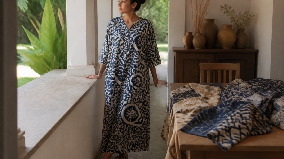
Table of Contents
- Understanding Bold Block Prints and Their Visual Impact
- Step 1: Choose Your Neutral Foundation
- Step 2: Apply the Rule of One Statement Piece
- Step 3: Balance Bold Prints with Solid Textures
- How to Mix Patterns in Fashion Without Clashing
- Step 4: Adapt Your Block Prints for Different Seasons
- Step 5: Accessorise Your Patterned Pieces Strategically
- Caring for Hand Block Printed Clothing to Preserve Quality
- Traditional Block Printing Tools for Artisans and What They Mean for Your Pieces
- Common Mistakes to Avoid When Styling Bold Prints
- Frequently Asked Questions
Last Updated: September 28, 2026
Understanding Bold Block Prints and Their Visual Impact
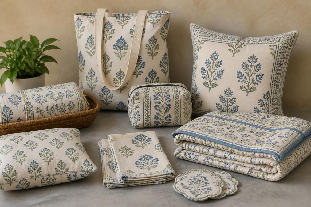
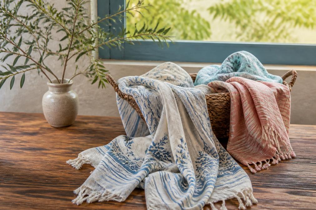
Hand block printing is a centuries-old craft that creates bold, distinctive patterns on fabric. At Bombay Artisans, we work directly with women artisans in India who use traditional techniques to hand block print each piece using natural dyes. The result is authentic, unrepeatable patterns that add character and warmth to any outfit.
Bold block prints aren't just decorative. They're statement pieces. A single hand block printed garment can transform your entire look. But here's what most people get wrong: you don't need a minimalist wardrobe to style bold block prints successfully. You need strategy.
The key is understanding visual balance. A bold print demands attention. Your job is to decide what else gets attention in that outfit. When you pair a vibrant hand block printed piece with the right foundation, accessories, and textures, it becomes effortless style instead of visual chaos.
This guide covers how to style bold block prints so they work in real life. We'll walk through the exact steps to build outfits that feel intentional, not accidental.
Step 1: Choose Your Neutral Foundation
Every bold print needs a grounding layer. This is your neutral foundation, the piece that anchors the outfit and lets the print shine.
Neutral doesn't mean boring. Think tailored trousers in charcoal, cream linen, or soft grey. Think solid-coloured basics in white, black, or natural cotton tones. These pieces create visual balance and prevent your outfit from feeling chaotic.
Here's the practical approach:
- Bottoms: Pair a bold print top with neutral trousers, jeans, or skirts. Solid colours work better than patterns here.
- Tops: If wearing a bold print bottom, choose a simple, solid-coloured top in a complementary shade.
- Layering: Use neutral jackets to contain the print. A quilted reversible jacket like the Frida in Pink works perfectly, wear the solid side out when you want the print to take a back seat.
The goal is simple: one bold element per outfit. Everything else supports it.

Step 2: Apply the Rule of One Statement Piece
This rule separates intentional styling from outfit accidents. A statement piece is the item that draws the eye first. It's usually your boldest element, the hand block printed garment.
When you wear a statement piece, every other element should be quieter. Not invisible, but quieter.
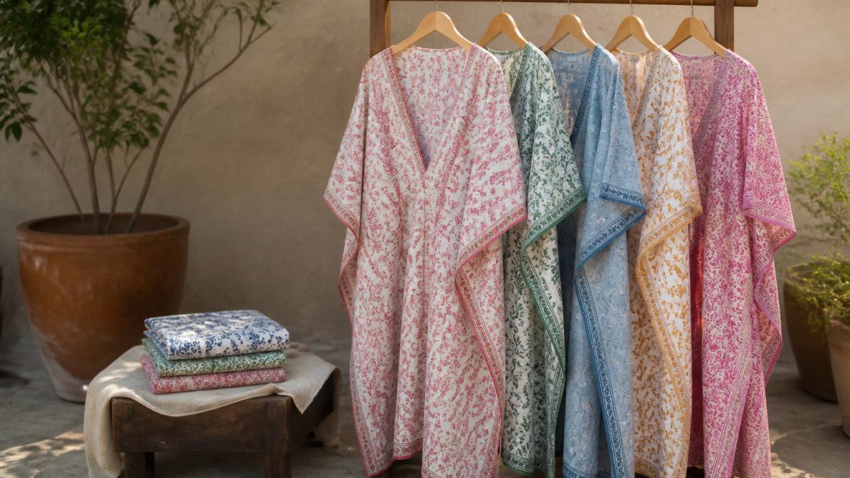
If your statement piece is a bold print kaftan, your jewellery should be minimal. If it's a patterned jacket, your shoes should be understated. If it's a hand block printed top with intricate detail, skip the patterned scarf.

One statement piece means:
- Bold print garment = minimal accessories, neutral bottoms, simple shoes
- Textured or embroidered jacket = simple layers underneath, clean silhouettes
- Patterned dress = neutral shoes, restrained jewellery, simple bag
The Ira Bagru print Kaftan is a perfect example. The Bagru print is intricate and detailed. Pair it with neutral sandals, a simple necklace, and a structured bag. Let the print do the talking.
When you follow this rule, your outfit looks curated. Without it, it looks like you grabbed everything at once.
Step 3: Balance Bold Prints with Solid Textures
Bold prints have visual weight. To prevent your outfit from feeling flat or chaotic, you need textural contrast.
Textural contrast means mixing smooth fabrics with textured ones. It means varying the visual density of your pieces.
Here's how it works in practice:
- Smooth + textured: A sleek hand block printed cotton top paired with a quilted jacket creates depth. The smooth print contrasts with the quilted texture.
- Dense + airy: A bold patterned piece in heavy cotton looks different than the same print in lightweight linen. Choose fabric weight based on season and visual balance.
- Structured + relaxed: A tailored hand block printed jacket over soft, flowing trousers balances structure with ease.
The Rasika Reversible Cotton Quilted Jacket demonstrates this perfectly. The quilted texture adds depth and visual interest without competing with the print. Wear it over a plain cotton shirt for maximum contrast.

Solid textures also prevent visual overload. When everything is patterned, nothing stands out. When you mix bold prints with solid, textured pieces, the print becomes the focal point.
How to Mix Patterns in Fashion Without Clashing
Pattern mixing is advanced styling. Most people avoid it because they lack a framework. But when done correctly using colour theory principles, mixing patterns creates depth and sophistication instead of visual chaos.
The key is understanding how colours interact on the colour wheel. This isn't arbitrary, it's the foundation of why some pattern combinations feel harmonious and others clash.
Complementary colour mixing: Colours opposite each other on the colour wheel (indigo and warm orange, or forest green and rust) create high contrast and visual energy. When mixing patterns with complementary colours, use one bold pattern and one small-scale pattern to prevent the combination from feeling aggressive. For example, a large-scale indigo block print paired with a small geometric pattern in cream and rust works because the scale difference prevents the complementary colours from overwhelming the eye.
Analogous colour mixing: Colours next to each other on the colour wheel (indigo, teal, and green) feel naturally harmonious. This is the easiest pattern combination for beginners. Two patterns in analogous colours can both be medium-scale without clashing because the colours already feel related. A hand block printed top in indigo paired with a teal patterned scarf feels intentional, not accidental.
Monochromatic pattern mixing: Multiple patterns in the same colour family (different shades of indigo, from navy to pale blue) always work together because they share a single colour. This is the safest approach. A dark indigo block print layered under a lighter indigo patterned jacket creates visual interest through scale and tone variation, not colour conflict.
The scale principle in practice: Large-scale prints have more visual weight than small-scale patterns. When mixing two patterns, always pair large with small. A large-scale hand block print (where the motif repeats every 10-15 centimetres) paired with a tiny geometric print (where the motif repeats every 2-3 centimetres) creates visual hierarchy. The eye reads the large print first, then discovers the smaller pattern as a supporting detail. Two large-scale patterns compete for attention and create visual chaos.
Practical framework for pattern mixing:
- Same colour family (safest): Two patterns in navy and cream, or two patterns in shades of indigo. Colour harmony is guaranteed. Vary the scale: large block print with small geometric.
- Analogous colours (intermediate): Patterns in indigo, teal, and green. These colours sit next to each other on the colour wheel and feel naturally related. Keep one pattern bold and one small-scale.
- Complementary colours (advanced): Patterns in indigo and warm orange, or forest green and rust. Use sparingly, one bold pattern and one small pattern only. The colour contrast is already high; scale contrast prevents visual overload.
- Separate patterns with solids: Never let two patterns touch directly. A bold print top with a patterned scarf works only if they're separated by a neutral jacket or solid shirt. This physical separation prevents the patterns from competing.
- Limit to two patterns maximum: Three or more patterns in one outfit requires expert-level colour theory knowledge. Stick to two while learning.
Why this matters for hand block prints: Hand block printed garments often feature multiple colours within a single pattern, indigo with cream, or green with rust and gold. When selecting a second pattern to mix with your block print, identify which colour in the print is dominant, then choose your second pattern from that colour family or from a complementary colour. A hand block print that is predominantly indigo with rust accents pairs beautifully with a small cream geometric pattern (analogous to indigo) or a small rust pattern (echoing the accent colour). Both approaches feel intentional because they're rooted in colour theory, not chance.
Step 4: Adapt Your Block Prints for Different Seasons
Hand block printed clothing works year-round, but styling changes with the season.
Spring and summer: Lightweight hand block printed kaftans and cotton tops are ideal. The natural dyes in traditional block printing create colours that feel fresh without being harsh. Pair with minimal layers and breathable fabrics.
Autumn and winter: Layer bold prints under solid-coloured cardigans or quilted jackets. A hand block printed top under a neutral sweater creates visual interest while keeping you warm. The Indu Green Suzani Jacket works as a layering piece or statement jacket depending on what you wear underneath.
Seasonal adaptation also means adjusting fabric weight:
- Lightweight: Cotton kaftans and thin block printed shirts for warm months
- Medium weight: Standard cotton prints for mild seasons
- Heavy weight: Quilted hand block printed jackets for winter layering
Seasonal colour also matters. Winter block prints in deep indigo, forest green, or burgundy feel appropriate. Summer prints in cream, soft pink, or light blue feel fresh. Choose prints that match the season's natural colour palette.
Frida in Pink | Reversible Cotton →
Step 5: Accessorise Your Patterned Pieces Strategically
Accessories can either enhance or overwhelm a bold print. The rule is simple: when your main piece is bold, your accessories should be restrained.
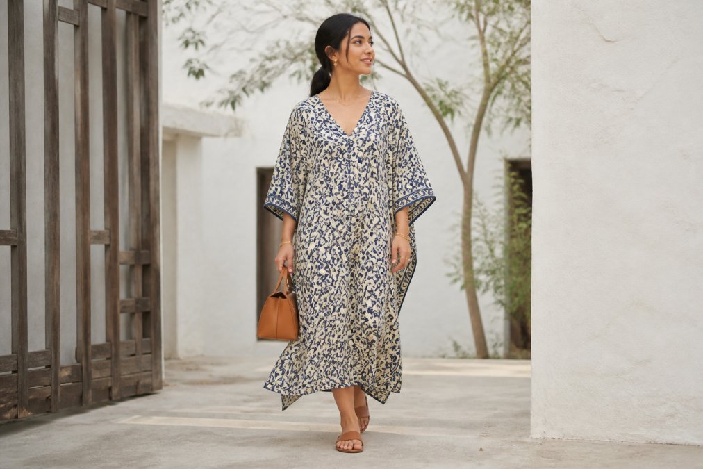
Strategic accessorising means:
- Jewellery: Keep it minimal and in one metal. Gold or silver, not both. A simple bracelet or necklace, not multiple pieces.
- Bags: Choose structured, solid-coloured bags. A neutral leather tote balances a bold print better than a patterned bag.
- Shoes: Neutral footwear works universally. Cream, black, tan, or natural leather. Skip patterned or metallic shoes when wearing bold prints.
- Scarves: If wearing a scarf, keep it solid or use it as a layering piece, not an accessory.
The goal is to frame the print, not compete with it. Your accessories should enhance the outfit without drawing attention away from the hand block printed piece.
When you wear a bold print, think of your accessories as supporting players. They're there to complete the look, not to be noticed.
Caring for Hand Block Printed Clothing to Preserve Quality
Hand block printed garments need gentle care to maintain their beauty. Natural dyes and handcrafted construction require different washing than mass-produced clothing.
Proper care extends the life of your pieces and keeps colours vibrant:
- Hand wash in cold water: Use cool water and mild soap. Hot water fades natural dyes.
- Minimal agitation: Don't scrub or wring. Gently squeeze soapy water through the fabric.
- Line dry only: Machine drying damages hand block printed pieces. Hang to dry in shade to prevent colour fading.
- Avoid bleach and harsh chemicals: Natural dyes are sensitive. Stick to gentle, plant-based detergents.
- Iron on low heat: If needed, iron on the reverse side using low heat. High heat can damage natural dyes.
Natural textile care guidelines
Many customers ask how long hand block printed pieces last. With proper care, they last for years. The natural dyes actually improve with age, developing a subtle patina that adds character.
Store your pieces flat or folded, not hanging, to prevent stretching. Keep them away from direct sunlight when not wearing them.
Traditional Block Printing Tools for Artisans and What They Mean for Your Pieces
Understanding how hand block prints are made helps you appreciate what you're buying. It also helps you identify authentic pieces.
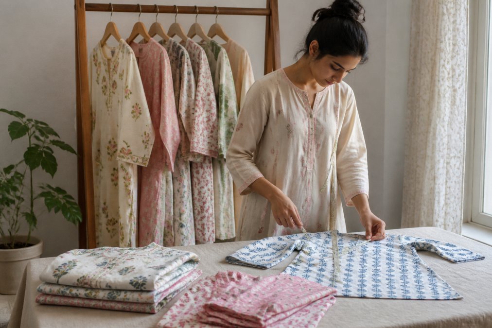
Traditional block printing uses wooden blocks carved with intricate designs. Artisans dip these blocks into natural dye and press them onto fabric by hand. Each press is slightly different, which is what makes hand block printing authentic.
The tools include:
- Wooden blocks: Hand-carved from teak or other hardwoods. Each design can take weeks to carve.
- Natural dyes: Made from plants, minerals, and traditional recipes. Indigo, madder root, turmeric, and pomegranate create the colours.
- Printing tables: Flat surfaces where fabric is laid and blocks are pressed.
- Mallets: Used to strike the block and transfer the dye evenly.
What this means for your pieces: every hand block printed garment is unique. Slight variations in colour, pattern placement, and intensity are proof of authenticity. These aren't flaws. They're signatures of handcrafted quality.
At Bombay Artisans, each piece is hand block printed by women artisans using these traditional methods. You're not buying mass-produced fabric with a printed pattern. You're buying a handcrafted textile.
This is why hand block printed clothing requires gentle care and costs more than machine-printed alternatives. The labour, skill, and natural materials justify the investment.
Traditional block printing techniques and cultural heritage
Common Mistakes to Avoid When Styling Bold Prints
Most styling mistakes happen because people treat bold prints like regular clothes. They don't. The most costly mistake is ignoring how print scale affects visual proportion on different body shapes.
Mistake 1: Ignoring print scale relative to your body frame. Large-scale prints can overwhelm petite frames or make broader frames appear wider. Small-scale prints can disappear entirely on taller or larger frames. This isn't about body size judgment, it's about visual proportion.
Here's the principle: the larger your frame, the larger the print scale should be. A petite person (under 160 centimetres) wearing a hand block print where the motif repeats every 15 centimetres may find the print visually dominates their silhouette. The same print on a taller person (over 180 centimetres) reads as balanced. Conversely, a small-scale print (motif repeats every 3-4 centimetres) on a petite frame creates visual interest without overwhelming; on a larger frame, it can feel busy or insubstantial.
When choosing a hand block printed piece, hold it up and assess: does the scale of the pattern feel proportional to your frame? If the print motifs are larger than your hand span, consider whether your body frame is large enough to carry that scale. If the motifs are smaller than your thumb, ensure your frame is petite enough that the print doesn't disappear.
Mistake 2: Placing bold prints without considering visual weight distribution. A large-scale print worn at the bust or hips adds visual weight to that area. On an apple-shaped body (weight carried at the centre), a bold print top draws attention to the midsection. On a pear-shaped body (weight at hips and thighs), a bold print skirt emphasises that area.
This isn't a rule to avoid, it's a rule to use intentionally. If you want to balance proportions, place the bold print where you want to draw the eye. A bold print top on a pear-shaped body draws attention upward, balancing a fuller lower half. A bold print skirt on an apple-shaped body can ground the silhouette if the print is grounded in darker tones.
Mistake 3: Pairing two bold prints without strategy. Bold prints need breathing room. If you must mix prints, follow the colour palette and scale rules covered earlier. Most of the time, one bold print per outfit is the right choice. When two bold prints are worn together, they compete for attention and create visual fatigue.
Mistake 4: Adding too many accessories. A bold print is already doing the work. Adding statement jewellery, a patterned scarf, and metallic shoes overwhelms the look. Choose one or two simple accessories instead. The bold print should be the focal point; everything else should support it.
Mistake 5: Forgetting about colour balance. If your hand block print is predominantly dark (like indigo), balance it with lighter neutrals to prevent the outfit from feeling top-heavy. If it's predominantly light, ground it with darker pieces. Colour balance prevents your outfit from feeling visually unbalanced.
Mistake 6: Wearing bold prints in the wrong context. A vibrant hand block printed kaftan is perfect for casual gatherings and home wear. It's less appropriate for formal business settings. Consider the occasion before choosing your piece. Professional environments typically call for more restrained styling; social and creative contexts welcome bolder choices.
Mistake 7: Not considering fabric care from the start. Hand block printed pieces fade faster with improper washing. Neglecting care means your investment loses its appeal quickly. Follow care instructions from the first wear: hand wash in cold water, line dry in shade, and use gentle detergents. This extends the life of your pieces and keeps colours vibrant.
Mistake 8: Choosing print scale based on trend rather than proportion. Current fashion may favour oversized prints, but oversized doesn't mean flattering on every body. Assess what scale works for your frame, then choose pieces in that scale regardless of trend. A well-proportioned print in a classic style outlasts a trendy oversized print that doesn't suit your silhouette.
The common thread in these mistakes is treating bold prints carelessly. Hand block printed clothing deserves intentional styling, thoughtful proportion assessment, and proper care. When you account for print scale, body shape, colour balance, and context, a single authentic, handcrafted piece transforms your entire look.
Frequently Asked Questions
How do you mix bold block prints without clashing?
Start with one dominant statement piece in a bold block print, then anchor the outfit with neutral bottoms or tops in solid colours. Keep a second pattern to a smaller scale or complementary colour family, and separate the two patterns with a solid neutral layer. The key is visual breathing room: let your eye rest between patterns. Avoid pairing two equally bold prints of similar scale directly against each other. Use colour blocking principles to create intentional contrast rather than accidental visual noise.
What are the best neutral colours to pair with bold block prints?
Cream, soft grey, charcoal, and natural ivory create a calm foundation that lets your print stand out. White works for high-contrast drama, but softer neutrals feel more refined and are easier to wear year-round. Black can feel harsh against vibrant natural dyes, so reserve it for evening styling. Consider the undertones in your print: warm-toned prints (terracotta, ochre, rust) pair beautifully with warm neutrals like taupe or warm grey, while cool-toned prints (indigo, cool florals) suit cool greys and soft whites. Tailored trousers or simple solid skirts in these shades create the visual balance needed to let your block print shine.
How do I care for hand block printed clothing to keep the colours vibrant?
Hand block printed pieces made with natural dyes require gentle care. Always hand wash in cold water with minimal soap, and avoid full soaking which can fade colours over time. Line dry away from direct sunlight to preserve the vibrancy of natural dyes. Never use hot water or a washing machine, as agitation breaks down the hand-printed surface. Turn garments inside out before washing to protect the printed side. Store in a cool, dry place away from direct light. With proper care, authentic hand block printed cotton can last for years, maintaining its character and beauty.
Are there specific accessories that complement bold block prints?
Yes. Minimal jewellery in natural metals (gold, brass, silver) or wood works best with bold prints, avoid competing patterns or busy designs. A simple leather belt in a neutral tone defines the silhouette without distraction. Solid-coloured scarves that echo one colour from your print can tie the look together. For footwear, keep it understated: neutral leather shoes, simple sandals, or minimalist trainers prevent visual overload. A structured tote bag in a complementary solid colour (cream, soft grey, or a muted tone from your print) completes the look without fighting for attention. The principle is restraint: let your block print be the focal point.